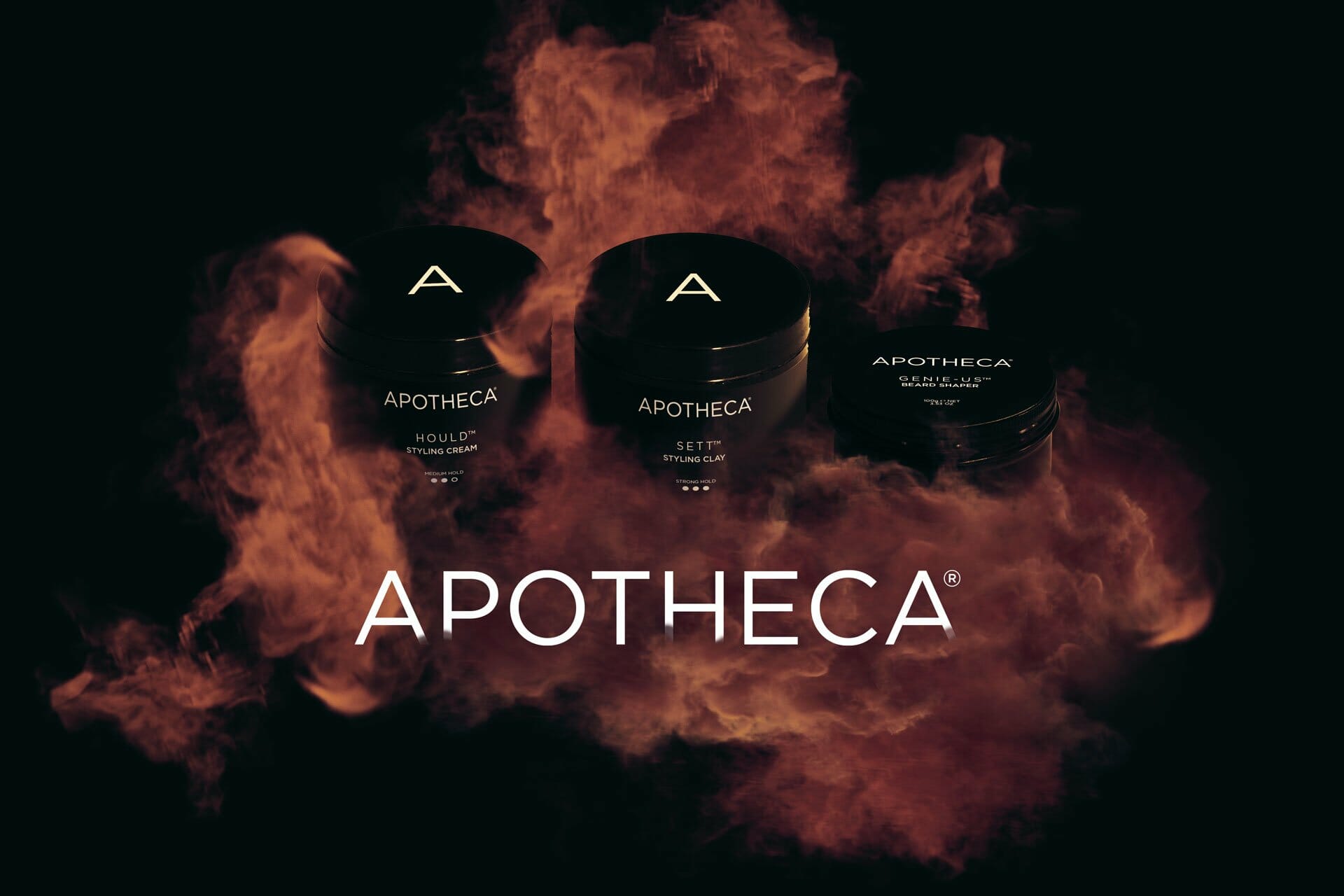
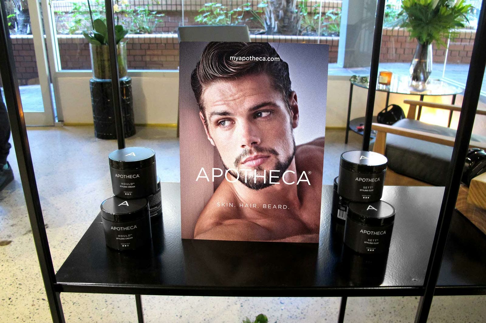
Apotheca® is a natural range of products for the skin, hair and beard.
We have been involved from the brands inception, creating a holistic brand experience. We have created the brand identity, packaging, brand styling for social & conventional media as well as all online executions including website and EDM’s.
Creative
All Design & Communication
Client
Apotheca Group
Completed
September 2018
Project overview
We were engaged to create a new range of natural products. The brief was to create something that was clean and sophisticated and that didn’t look like anything else on the market. Everything needed to be unique, from the packaging to the imagery and every touch point for the brand.
Pronounced
/a-poth-ee-ca/
Apotheca is latin for apothecary (pharmacist/chemist)
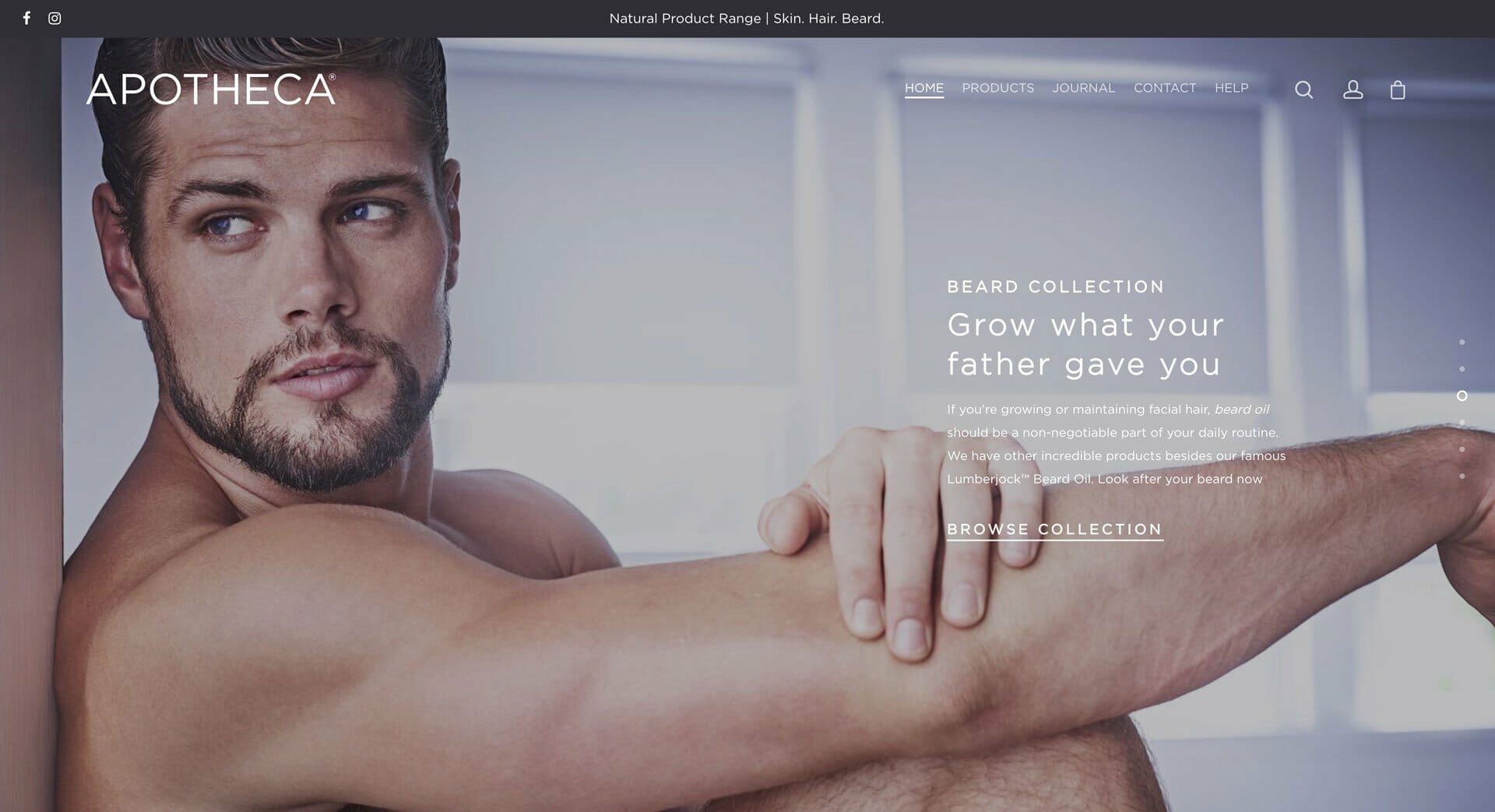
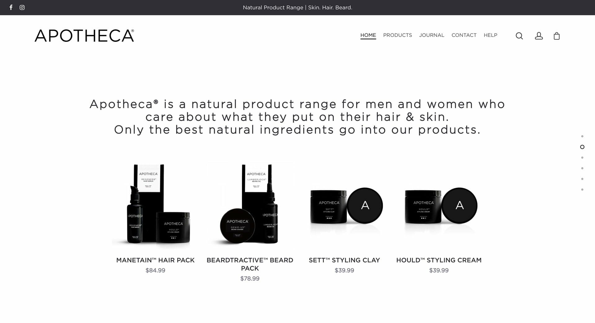
Website
Email Campaigns
Promo Videos
Social Marketing
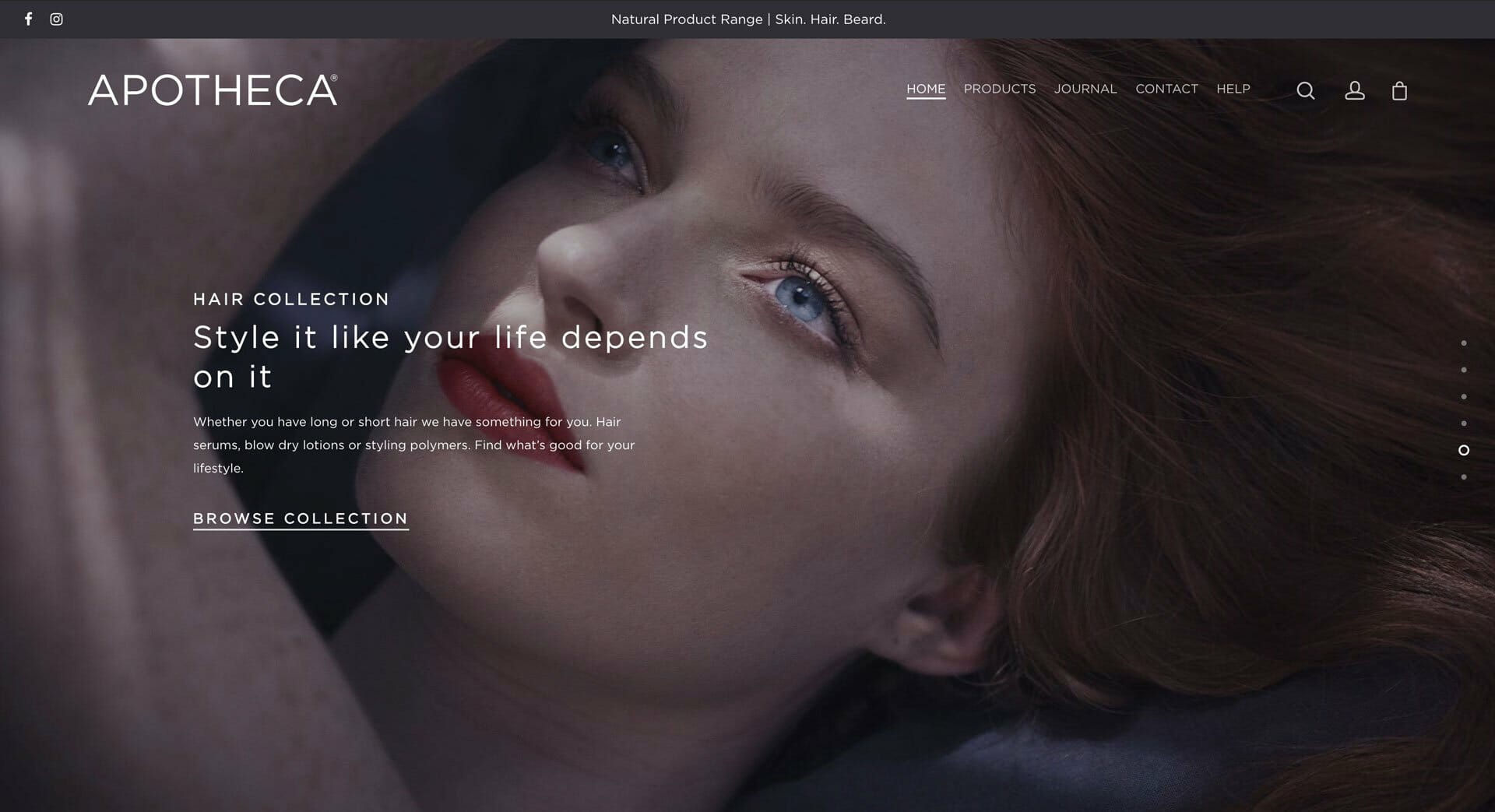
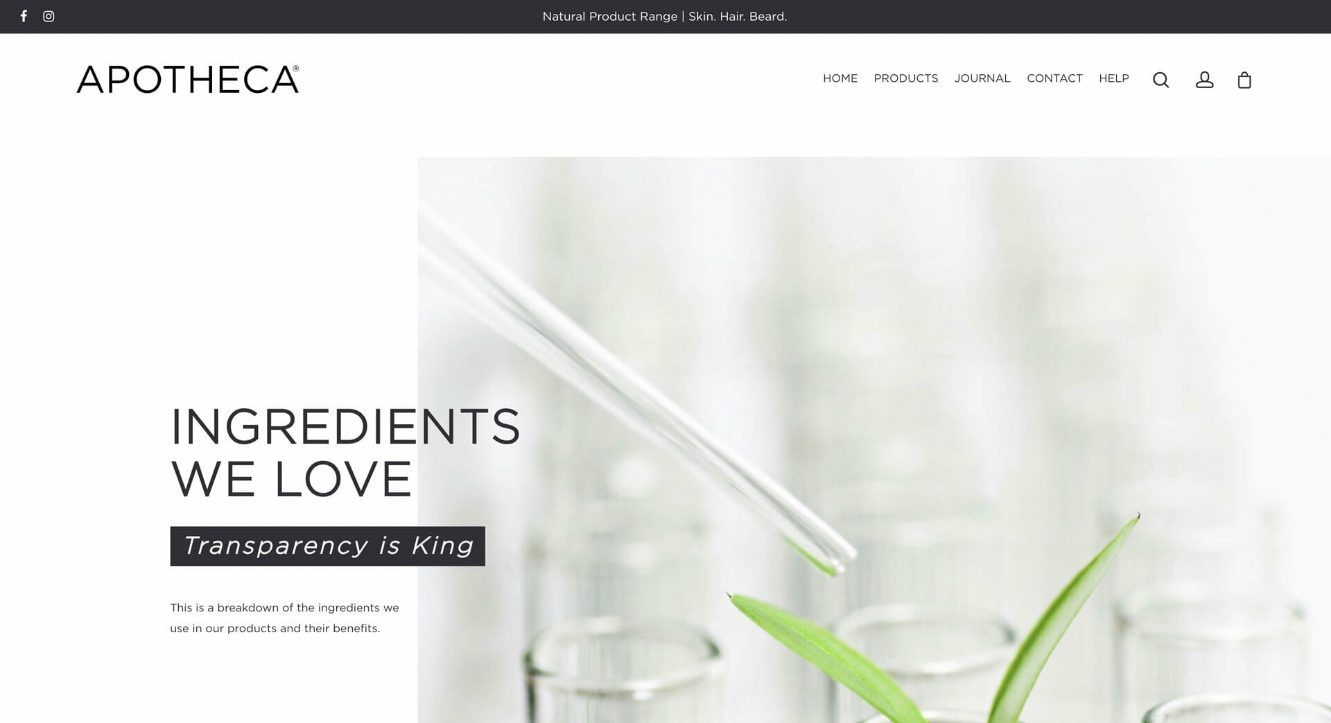
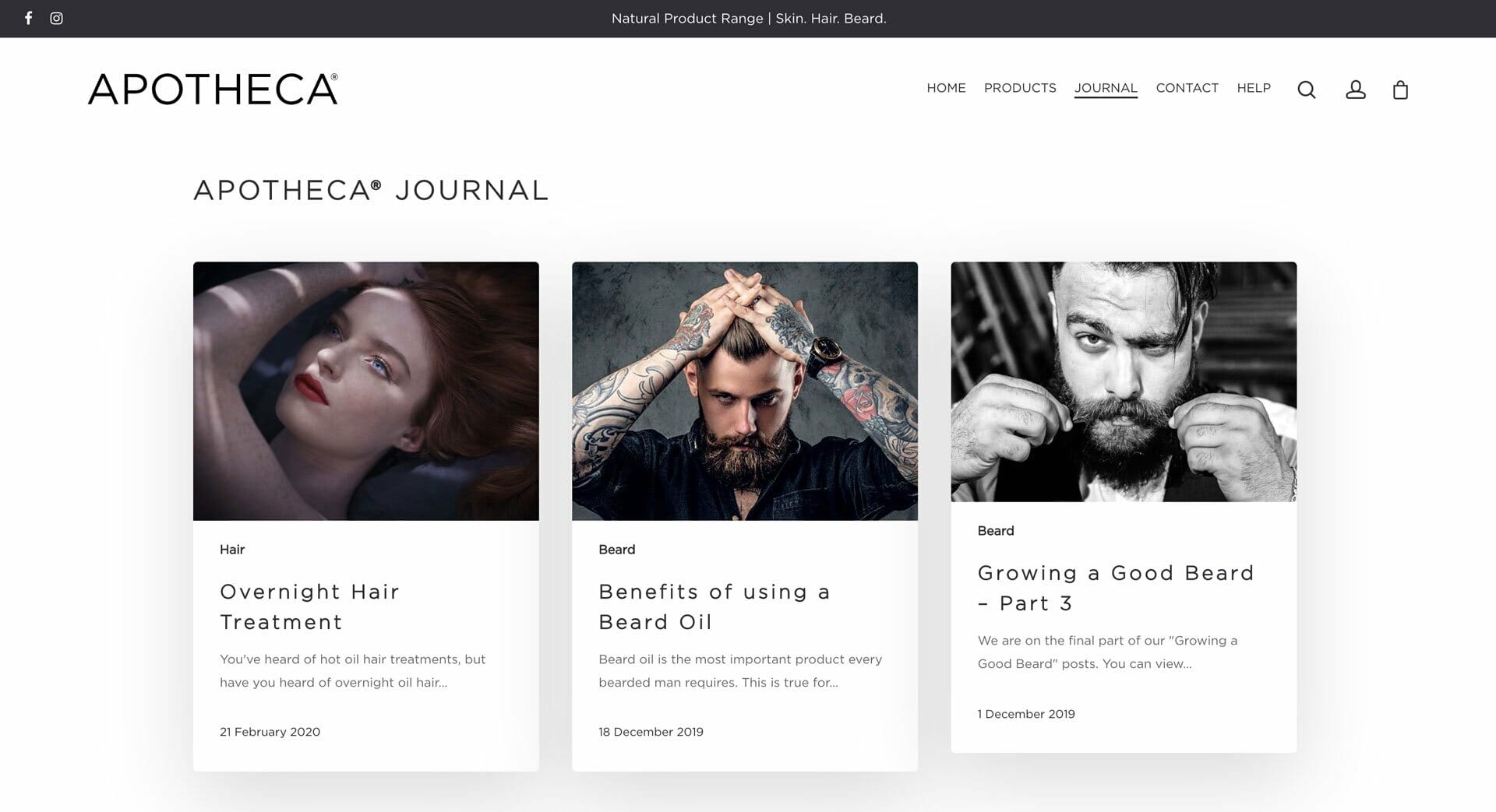
All aspects of Apotheca® reflect the sleek stylishness of the brand and the website is no exception. The website is clean using a lot of white space so the product and images become the hero. The website is created in Woocommerce and utilises many of the features the platform has to offer. The loyalty program allows regular users to the website to get discounts on future purchases. We utilised the advanced email system to keep users engaged automatically using triggers at certain times after specific purchases.
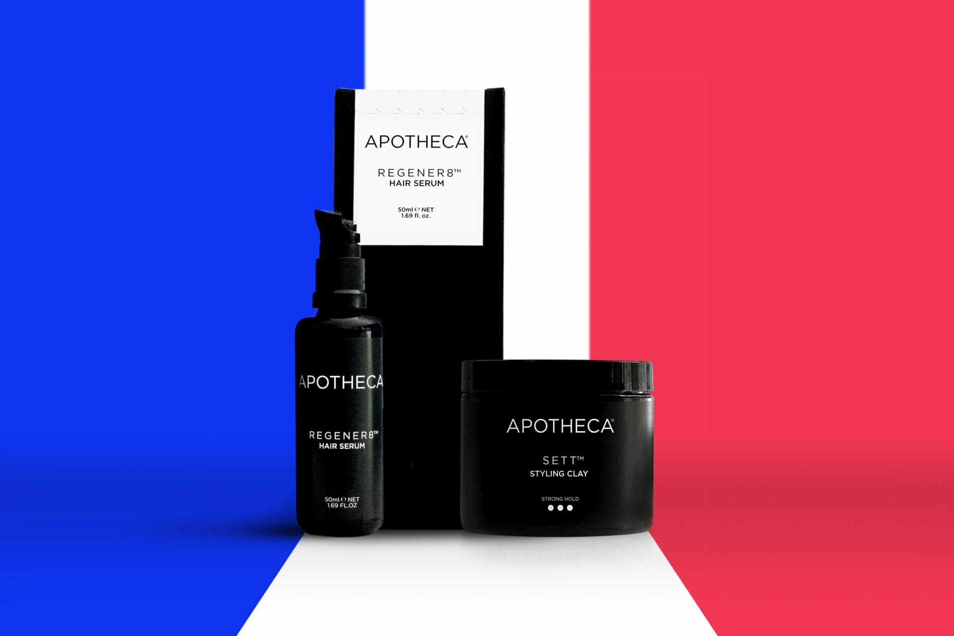
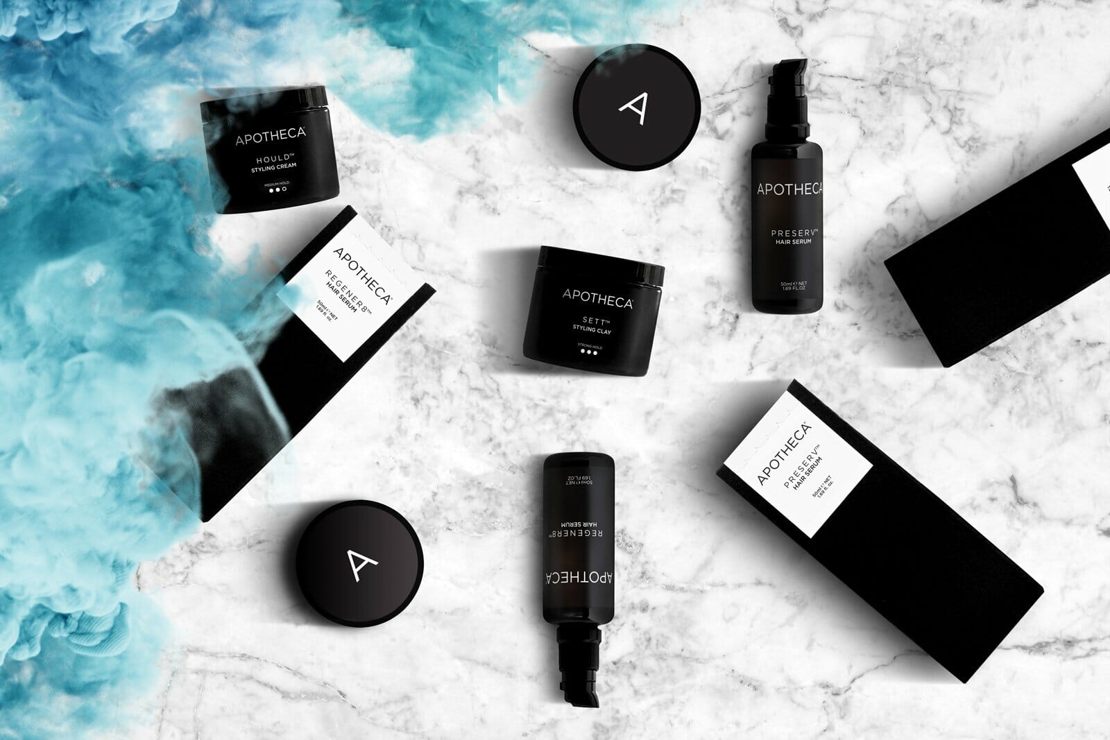
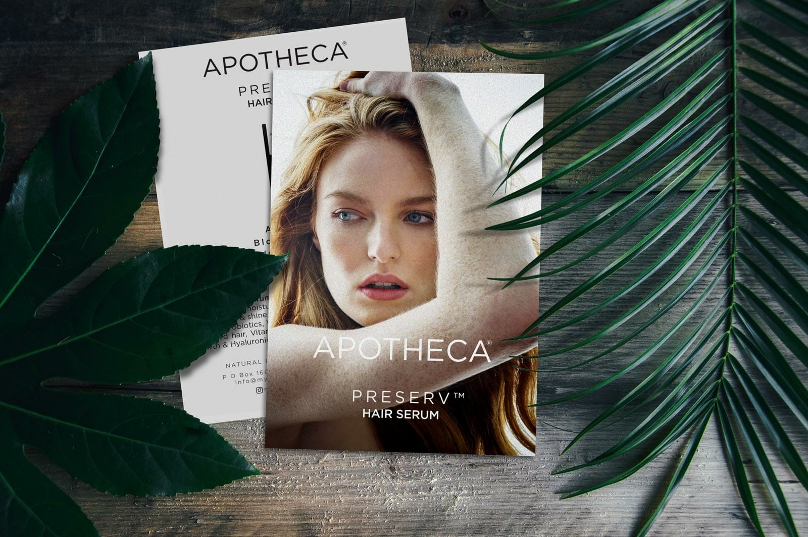
Packaging
Product Cards
Stationery
We wanted the packaging to be simple and unusual. We came up with a solid black box that could be used for all future products as there was no printing on the box. The box was also a crush bottom box so when the products were on the shelves they couldn’t be opened. A seperate white card with a zipper tear would be adhered on the top and folded around and adhered to the front of the box. This would make the box unopenable unless you used the zipper tear to open.
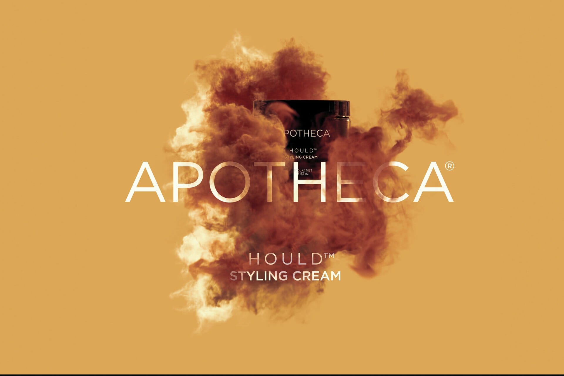
Some of the creative done for the project